Where your next adventure awaits
Pacific Expeditions is a curated adventure travel brand built for those who crave more. Designed for explorers aged 25–40, the brand provides memorable, experience driven adventures through the rugged beauty of the Pacific Northwest — where every trail, river, and ridgeline tells a story worth chasing.
Problem Statement
The Pacific Northwest adventure travel space is crowded with brands that either feel rugged and outdated or overly corporate. There was an opportunity to create a brand that speaks directly to a younger, experience-driven audience — one that feels premium without being exclusive, and adventurous without looking like every travel company. Pacific Expeditions needed an identity that could stand out on a trail map and a social feed.
Research & Inspiration
Competitive Research
The process began with doing some competitive research. Some specifics I was looking for as I analyzed the industry were what are they offering, who are they targeting, who would be attracted to their specific branding identity? This information helped me identify the potential market gap and who my brand could serve.
MoodBoard
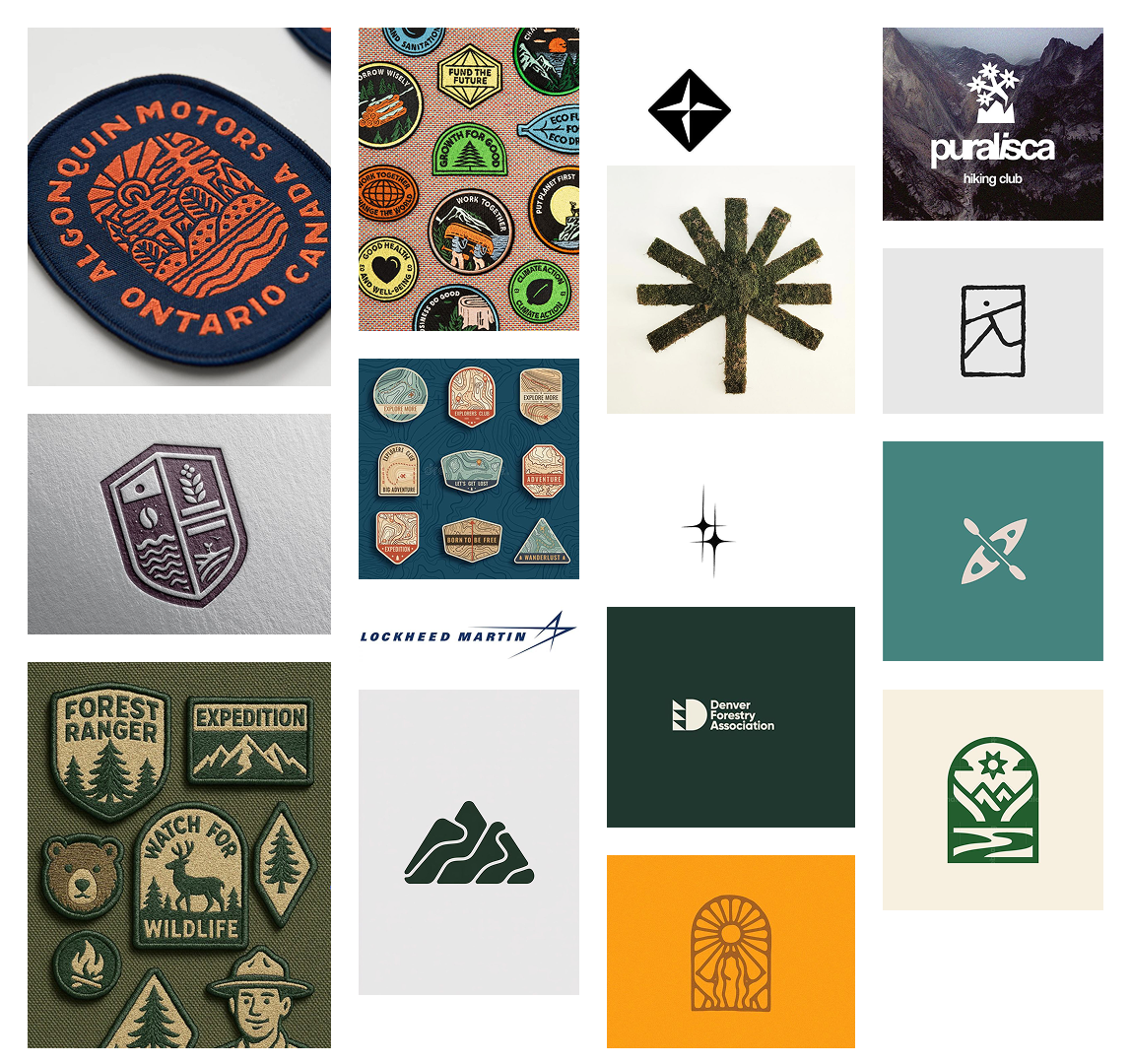
As I began to plan out potential concepts for the moodboard, I tried to visualize the types of memories and level of energy, for example, some people want a calm, relaxing vacation; for others traveling looks doing as much as possible and seeking the biggest thrill.

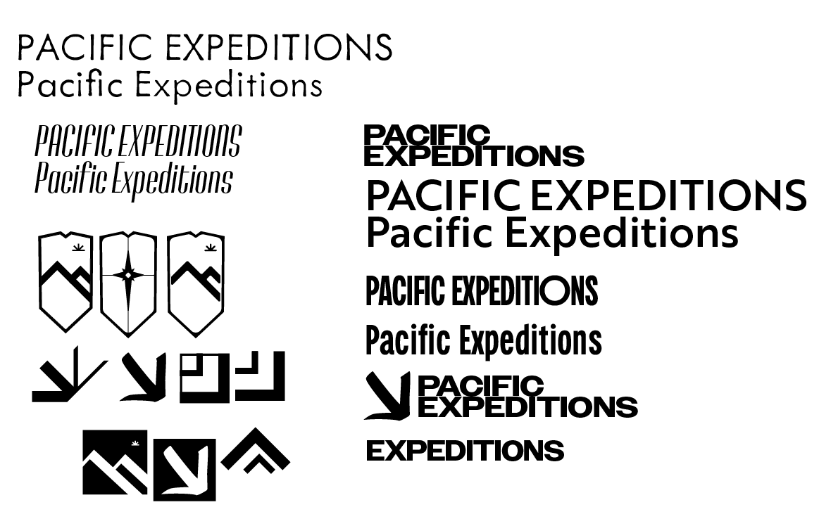
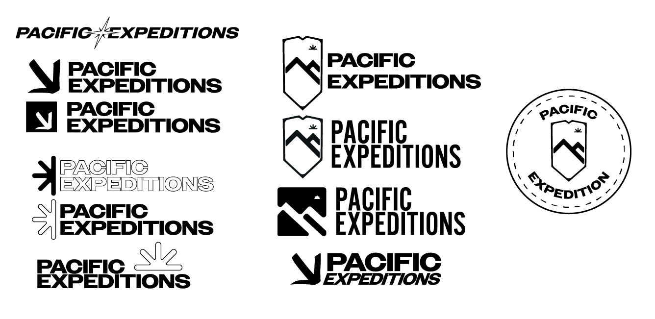
After creating the three different moodboards, I ultimately went with the second concept and modified it further to add more energy into the branding, while still appealing to a younger, experience-driven demographic.
Inspiration
At this stage, I was already inspired by patchwork logos. I really liked the traditional look of a crest or a round patch. It felt cozy, nostalgic and clearly communicates the outdoors. The idea of a legacy looking logo was the initial idea. Later on, I began exploring more simple but bold iconography. The idea of something a bit more bold felt right for this since I am trying to appeal to a younger demographic. Having a bolder look would add confidence and made it feel like a big adventure awaits vs logo that is lighter or more fine.
Brand Style Guide
When beginning my initial sketches, I was drawn to experiment with more illustrative designs that felt more traditional. The inspiration came from the thought of boyscouts, badges, patches, camping, nature etc. I wanted to try to fit a design within a shape, or taking on a shape. Then I started to simply and experimenting with a more modern look seeking something more structured and bold since I kind of had a mood in mind already.
Reflections & Learnings
What I learned from this branding assignment was that, beyond the standard logo and branding. The social media and marketing side has a significant stake in creating a cohesive brand image. It is very clear that a visual identity of a brand is not enough to establish the brand but requires deep consideration regarding the type of content the brand produces and how the brand communicates its content. As I was building and looking for a tone of voice for the brand, it was interesting to realize how the visual aspect influences the process of developing that voice.